
Introduction
Strapi is developed by a (mostly) French team offering another very easy way to deploy a full-featured API for your front-end application.
It is based on Node.js & React.js, can be self-hosted or deployed to the cloud (Digital Ocean, Heroku etc) and uses both a REST and a graphQL API for your requests.
I usually look for two things in a headless CMS:
- the ease of use, both for me as a developer and for my client, who often is a non-technical user.
- the potential for advanced customization, like adding custom input fields specific to the client's business use case.
Strapi offers both and tweaking can be done through a plugin system we will now explore.
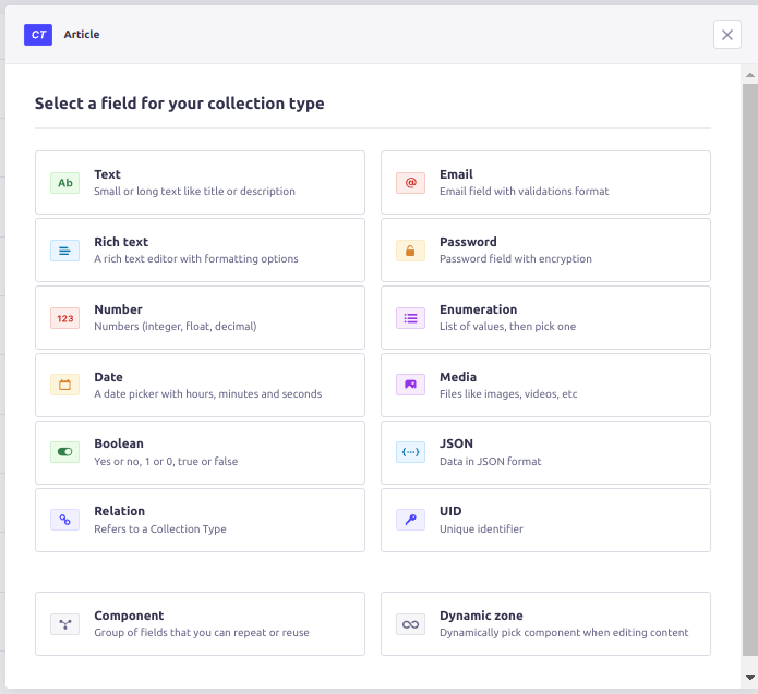
Plugins
Plugins can be seen as a way to enhance your application and, if my understanding is correct, are themselves key components of Strapi as their whole schema builder (Content-Type Builder) and Media Library are indeed plugins.
Talking about schema, creating new models for your content is extremely easy as Strapi provides a list of types directly available covering most of your needs.
However it is, as mentioned, fairly common to need custom types and I decided to try to build my own: font awesome icons library.
Strapi's documentation is a good place to start, as it covers a lot of topics, from quick start to deployment. I quickly noticed the community was also very active with a lot of content available on Youtube.
This section of the docs gives a basic understanding of the direction to take. In order to use font awesome icons.
3 Steps to Create Font Awesome Icons Plugin for Strapi
1) Generate a new plugin via the cli
yarn run strapi generate:plugin my-custom-fieldThis will create a general plugin folder at the source of your project, containing a folder for your new font awesome icon library plugin. You'll notice this folder contains itself a bunch of files and even a package.json, acting in a way as an isolated program within your app.
This would, for example, enable you to create custom routes & responses for your API if needed.
In our case, we simply want to display an input component, so no need for routes.
2) Build your components
The next step is to build the component itself.
react-fontawesome is a neat little package giving you the easy way to render a Font-Awesome icon in a react app out of the box, let's add it via.
npm i @fortawesome/react-fontawesomefortawesome/free-solid-svg-icons is a neat little package giving you font-awesome icons out of the box, let's add it via.
npm i @fortawesome/free-solid-svg-iconsstrapi/design-system is a neat little package giving you strapi styling components out of the box, let's add it via.
npm i @strapi/design-systemNow let's build and style with the strapi/design-system.
src/plugins/my-custom-field/admin/src/components/MyFirstField/index.js
import React from 'react'
import { Grid, GridItem } from '@strapi/design-system/Grid'
import { fas } from '@fortawesome/free-solid-svg-icons'
import { FontAwesomeIcon } from '@fortawesome/react-fontawesome'
import { Box } from '@strapi/design-system/Box'
import { Searchbar, SearchForm } from '@strapi/design-system/Searchbar'
import { Tooltip } from '@strapi/design-system/Tooltip'
import { Typography } from '@strapi/design-system/Typography'
import { CopyToClipboard } from 'react-copy-to-clipboard'

const Field = props => {
  console.log('myfirstfield', props)

  const { name, value, onChange } = props

  const iconsArray = Object.keys(fas)
    .filter(icon => {
      if (!value) {
        return true
      }
      return icon.toLowerCase().includes(value.toLowerCase())
    })
    .sort()

  return (
    <>
      <Box>
      <Typography paddingBottom={9} style={{ fontWeight: '500' }}>
        Icons
      </Typography>
        <Box paddingBottom={8}>
          <SearchForm>
            <Searchbar
              name='searchbar'
              value={value}
              onChange={e => {
                const arg = {
                  target: {
                    name,
                    value: e.target.value
                  }
                }
                onChange(arg)
              }}
              clearLabel='Clearing the asset search'
              placeholder='Icons'
            >
              Search for an icon
            </Searchbar>
          </SearchForm>
        </Box>
        <Box padding={5} height='280px' overflow='scroll' background='neutral100'>
          <Grid>
            {iconsArray.map(icon => {
              return (
                <GridItem
                  padding={2}
                  col={2}
                  key={icon}
                  background={'neutral0'}
                >
                  <Box
                    onClick={() => {
                      const arg = {
                        target: {
                          name,
                          value: icon
                        }
                      }
                      onChange(arg)
                    }}
                  >
                    <Tooltip description='Copy import'>
                      <CopyToClipboard text={icon}>
                        <Typography fontWeight='bold' as='button' 	                            type='button'>
                          <FontAwesomeIcon icon={fas[icon]} />
                        </Typography>
                      </CopyToClipboard>
                    </Tooltip>
                  </Box>
                </GridItem>
              )
            })}
          </Grid>
        </Box>
      </Box>
    </>
  )
}

export default Field
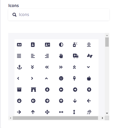
Nothing fancy here, we simply create a nice searchable Font-Awesome icon window acting as our icons library.
You can even search for your required icon. Our library will filter out the icons according to the value you have entered inside the search bar. You have to click any of the icons in order to select one.
Registering the my-custom-field plugin via the admin/src/index actually exposes a collection of props to the component, including an onChange prop needed to pass its values over to the platform.
3) Expose the plugin to your application
Now that we have a functional icon library, we need to be able to use it within our CMS. And this is where it got tricky!
The doc mentions registering the plugin and the new field via the admin index
src/plugins/my-custom-field/admin/src/index.js
import { prefixPluginTranslations } from '@strapi/helper-plugin';
import pluginPkg from '../../package.json';
import pluginId from './pluginId';
import myfirstfield from './components/MyFirstField'


const name = pluginPkg.strapi.name;

export default {
  register(app) {
    app.addFields([
      { type: 'my_custom_field_renderer', Component: myfirstfield },
    ]);
  },

  bootstrap(app) {},
  async registerTrads({ locales }) {
    const importedTrads = await Promise.all(
      locales.map((locale) => {
        return import(
          /* webpackChunkName: "translation-[request]" */ `./translations/${locale}.json`
        )
          .then(({ default: data }) => {
            return {
              data: prefixPluginTranslations(data, pluginId),
              locale,
            };
          })
          .catch(() => {
            return {
              data: {},
              locale,
            };
          });
      })
    );

    return Promise.resolve(importedTrads);
  },
};
This is where I expected to come back to my GUI and be able to select the Icons from the library. Wrong! The library wasn't showing anywhere...
After a bit of digging, I discovered that custom fields could not yet be added via the GUI but had to be added directly in the schema models.As I experimented using the Flexi-Blog theme, I decided to add an icon library to the Topic.
This particular block of code will be added in the schema file of the collection in which you are planning to show font awesome icons. Here i am taking type as string because i am returning the name of icon from the react props.
strapi-backend/src/api/category/content-types/category/schema.json
 "icons": {
      "type": "string",
      "customFieldConfig": {
        "fieldRenderer": "my_custom_field_renderer"
      }
  }
Victory, the font awesome icon library now shows up !!!!
Here we are! Changes are now recognized, can be saved to the database and are available via the API.
Conclusion
This exploration into Strapi development showcases its effectiveness in smoothly integrating custom features, such as the Font Awesome icon library, into the CMS. The tutorial, covering plugin generation, component building, and schema integration, highlights Strapi's versatility and developer-friendly approach, making it an excellent choice for those aiming to enhance their CMS with personalized functionalities.