In current situation there are so many devices available in market with different sizes and different pixels so sometimes you will face issue is design UI of application for mobile devices like, some devices get appropriate output or in some devices it will not get output as per your mockup and expectations.
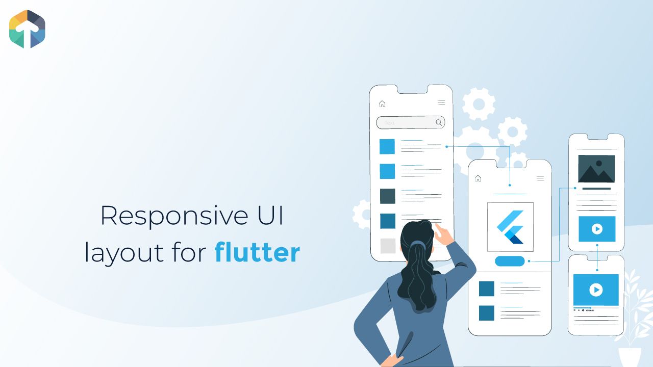
To overcome this issue in flutter mobile applications, Flutter allows you to create responsive application which is self-adapt to device's screen size and orientation.
Problem
Today we are going to discuss "How to implement responsive UI for dart and manage UI in different screen size ?"
Solution
Flutter provides BaseWidget to build UI using custom screen information as per devices to achieve your goal but using MediaQuery widget you will able to manage responsive layouts, fonts as well as all widgets.
MediaQuery Class
With MediaQuery class you can not directly change layout, but using this class you can find device's hight, width as well as its orientation and user preferences.
This is more helpful if you want to design your layout on the bases of any specific device size but it will give same output in all other size devices.
To get mediaQueryData just use following command:
MediaQueryData mediaQueryData = MediaQuery.of(context);On the basis of MediaQueryData you can get now device size, orientation, screen height, screen width, blockSize in horizontal, blockSize in vertical as well as safe area in vertical and horizontal both.
Safe area is like, if you want to create layout after notification bar then you have to get safe area with horizontal as well as if you want to manage device curve display and manage layouts vertical side then use safe area in with vertical.
To manage screen orientation and device type.
enum ScreenType {
  Mobile,
  Tablet,
  Desktop
}
To manage screenType as per device size create following function:
DeviceScreenType getDeviceScreenType(MediaQueryData mediaQuery) {
  var orientation = mediaQueryData.orientation;
  double deviceWidth = 0;
  if (orientation == Orientation.landscape) {
    deviceWidth = mediaQueryData.size.height;
  } else {
    deviceWidth = mediaQueryData.size.width;
  }
  if (deviceWidth > 950) {
    return DeviceScreenType.Desktop;
  }
  if (deviceWidth > 600) {
    return DeviceScreenType.Tablet;
  }
  return DeviceScreenType.Mobile;
}
Now, Manage widget size as per device height/size by creating DeviceSizeConfig file.
class DeviceSizeConfig{
 static MediaQueryData mediaQueryData;
 static double screenWidth;
 static double screenHeight;
 static double blockSizeHorizontal;
 static double blockSizeVertical;


 static double safeAreaHorizontal;
 static double safeAreaVertical;
 static double safeBlockHorizontal;
 static double safeBlockVertical;

 void init(BuildContext context) {
 mediaQueryData = MediaQuery.of(context);
 screenWidth = mediaQueryData.size.width;
 screenHeight = mediaQueryData.size.height;
 blockSizeHorizontal = screenWidth / 100;
 blockSizeVertical = screenHeight / 100;

 safeAreaHorizontal =
 mediaQueryData.padding.left + mediaQueryData.padding.right;
 safeAreaVertical =
 mediaQueryData.padding.top + mediaQueryData.padding.bottom;
 safeBlockHorizontal = (screenWidth -safeAreaHorizontal) / 100;
 safeBlockVertical = (screenHeight - safeAreaVertical) / 100;
 }
}
With this DeviceSizeConfig class, you can initialise its init method in any of your first screen of your dart project as below and use it throughout your whole project
class HomeScreen extends StatelessWidget {
 @override
 Widget build(BuildContext context) {
 SizeConfig().init(context);
  return Scaffold();
 }
}
Now, use config file data to create UI and manage widget's height, width
@override
Widget build(BuildContext context) {
 return Center(
  child: Container(
   height: SizeConfig.blockSizeVertical * 20,
   width: SizeConfig.blockSizeHorizontal * 50,
   color: Colors.orange,
  ),
 );
}
Another way is to use mediaQuery for manage layout without create any config class.
- Create enum class for fetch screen size.
enum ScreenSize { SMALL, MEDIUM_1, MEDIUM_2, LARGE }On the bases of device height decide currently app is run on which type of device.
- First, apply condition for screen size like,
ScreenSize fetchScreenSizeInHeight(double height){
 if(height <600){
   return ScreenSize.SMALL;
 }else if(height <700 && height > 600){
   return ScreenSize.MEDIUM_1;
 }else if(height < 800 && height > 700){
   return ScreenSize.MEDIUM_2;
 }
 else{
   return ScreenSize.LARGE;
 }
}- on the bases of screen size fetch screen size it dart file where you want to implement responsive layout.
double screenHeight = MediaQuery.of(context).size.height;

ScreennSize screenSize = fetchScreenSizeInHeight(screenHeight);- Now, create function for manage layout or any widget size like,
double setWidgetHeight(ScreenSize screenSize, BuildContext context, double small,double medium1,double medium2,double large){
  switch(screenSize){
    case ScreenSize.SMALL:
      return  MediaQuery.of(context).size.height * small;
      break;
    case ScreenSize.MEDIUM_1:
      return  MediaQuery.of(context).size.height * medium1;
      break;
    case ScreenSize.MEDIUM_2:
      return  MediaQuery.of(context).size.height * medium2;
      break;
    case ScreenSize.LARGE:
      return  MediaQuery.of(context).size.height * large;
      break;
  }
}
Same way you can create function for manage different size width as well as manage font height for different devices.
Use this function in your stateful/stateless class like below,
 class MyHomePage extends StatefulWidget {

 @override
 State<StatefulWidget> createState() {
   return _MyHomePageState();
 }
}

class _MyHomePageState extends State<MyHomePage> {

 @override
 Widget build(BuildContext context) {
   return Scaffold(
     body: Center(
       child:  Container(
            height: fetchSpaceSize(screenSize,context,0.35,0.3,0.4,0.3),
            alignment: Alignment.center,
  			 ),
           ],
         ),
     ),
   );
 }
Here, I shared idea of how to implement responsive UI layout and responsive widgets in flutter while you are creating application so with the help of this you can now able to create mobile application with responsive UI and manage UI in all type of screen sizes and screen orientation.