
Web Frameworks have come a long way. While we’ve seen our fair share of challenges, one constant thing is how technology is changing the world. Staying on top of the latest trends and tools is essential. React UI libraries and Frameworks are more exciting than ever. From Sleek design systems to powerful components, there’s something for everyone but wait!
No introduction is complete without some statistics in 2024, right? So, here are some numbers about React Native. According to NPM, there are more than 2 million downloads every week. Now that is not of the way, Let's dive deep into the Libraries and components of the React framework that are shaping web development like never before
FYI: I have thrown some of my favorites. In the end, stick around to find out!
Top 6 React UI Component Libraries for Web Development
To begin with, it’s been 12 years since its release in 2013, and many of the top companies still prefer it. Well, there are tons of reasons why to choose React for your next project, but lets focus on libraries; today, the React community has been growing and making it even more convenient for developers to build fabulous apps using this.
Alright! That is enough of a rant. Let's get cracking.
A. Material UI
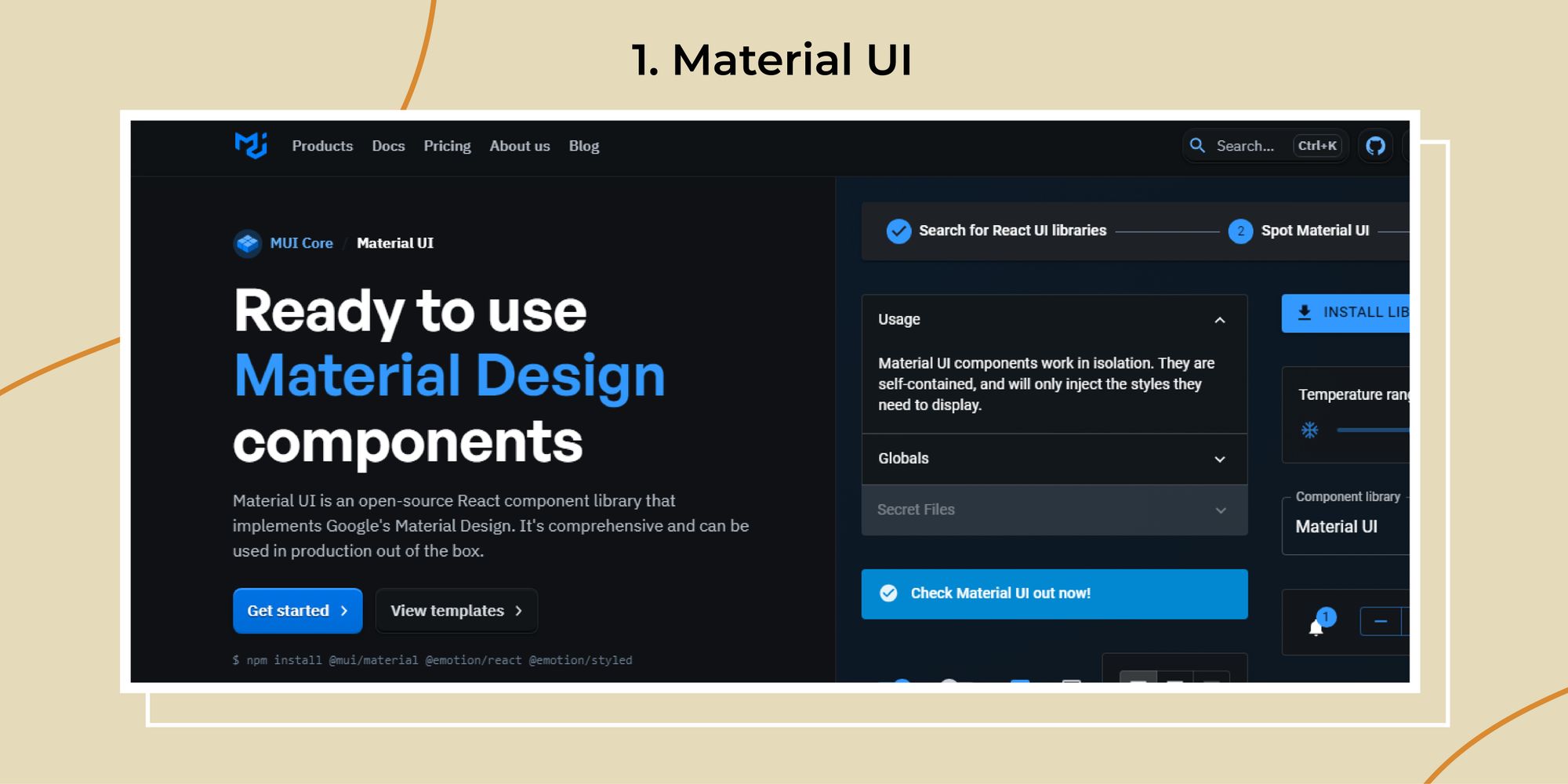
Material UI is one of the most popular React UI component libraries. It’s built on Google’s Material Design principles, emphasizing clean, modern design and a smooth user experience. Today, React Material UI has over 90K+ stars on Github, proving how the React Community loves this React Library.
Let’s dive into its features, pros, cons, and practical use cases to see how it can benefit your projects.
Features
- Pre-built Components: Material UI offers a wide range of ready-to-use components, such as buttons, cards, dialogs, and more, which help speed up the development process.
- Theming: It provides robust theming capabilities, allowing you to customize the look and feel of your application to match your brand.
- Accessibility: Ensures that components are accessible, following WAI-ARIA guidelines.
- Responsive Design: Components are designed to work seamlessly across different devices and screen sizes.
- Customization: High degree of customization through its styling solution based on CSS-in-JS.
Pros
- Speed of Development: Pre-built components help rapidly build applications without starting from scratch.
- Community Support: Strong community and extensive documentation make finding solutions and examples easier.
- Consistent Design: Following Material Design guidelines ensures a cohesive and professional look.
- Performance: Optimized for performance, ensuring smooth user interactions
Cons
- Learning Curve: For beginners, the extensive feature set can be overwhelming
- Opinionated Design: Sticking strictly to Material Design might not suit all projects or brands.
- Bundle Size: This can be heavier than other libraries if not optimized properly.
Use Cases
Material UI is an excellent choice for enterprise applications where a clean, professional, and user-friendly interface is essential.
For example, a financial dashboard that requires various data visualization components like charts and graphs can benefit from Material UI's comprehensive suite of pre-built elements. Its theming capabilities also allow fintech companies to match their corporate branding effortlessly.
B. React-Bootstrap
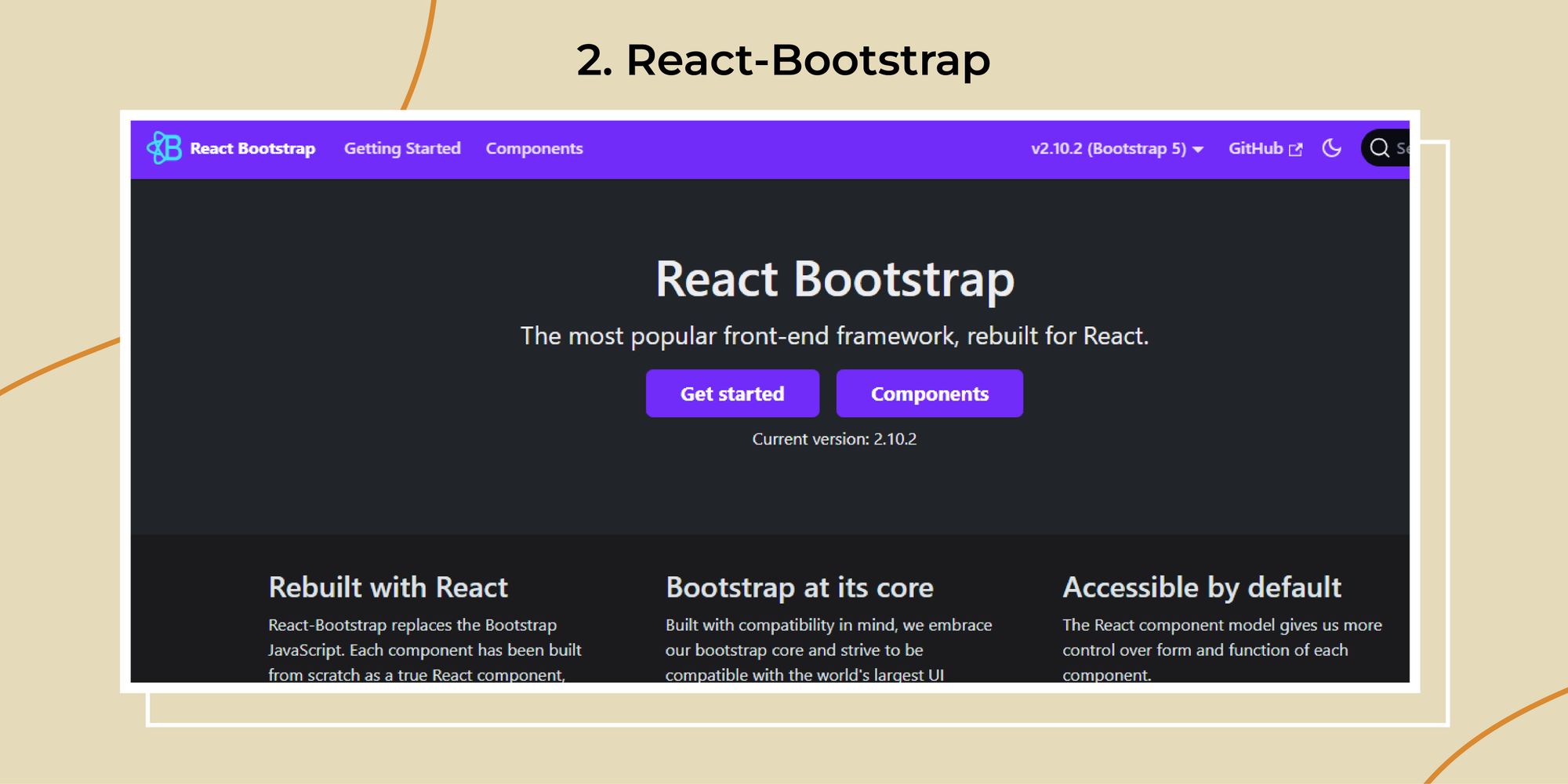
React-Bootstrap is a popular library that brings the power of Bootstrap components to React. By leveraging the simplicity and consistency of Bootstrap, React-Bootstrap provides a robust set of components that integrate seamlessly with React applications. Let’s examine its features, pros, cons, and use cases.
Features
- Bootstrap Components: Provides React components for all Bootstrap elements, such as models, forms, buttons, and navigation bars.
- Customization: Easily customizable through Bootstrap’s SCSS variables and utility classes.
- Responsive Grid System: Utilizes Bootstrap’s responsive grid system, making layout design straightforward
- Theming: Supports Bootstrap’s theming capabilities, allowing easy integration with custom themes.
- Accessibility: Ensures components are accessible, adhering to ARIA standards.
Pros
- Familiarity: Many developers are already familiar with Bootstrap, reducing the learning curve.
- Consistency: Ensures a consistent look and feel across different components and pages.
- Customization: Highly customizable with extensive documentation and community support.
- Responsive Design: Built-in responsiveness ensures applications look good on all devices.
Cons
- Opinionated Styles: o Bootstrap’s design may limit creative flexibility.
- Bundle Size: This can be relatively large if not optimized, impacting load times
- Dependency on Bootstrap: Requires understanding of Bootstrap’s CSS and theming system.
Use Case
React-Bootstrap allows for the rapid development of MVPs, ensuring that essential features are in place without compromising design.
For example, a patient management system can quickly incorporate forms for patient data, models for appointment scheduling, and responsive tables for medical records. This ensures a smooth user experience while allowing developers to focus on core functionalities
Read More : The Best React Native Animation Libraries and UI Components
C. Shad CN UI
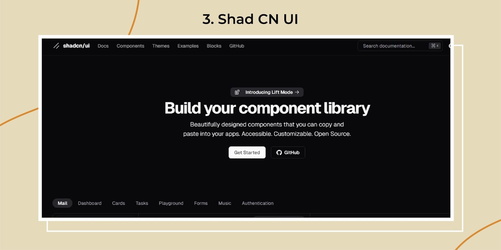
Well! Looking for a sleek and modern React UI component library? This is your stop. Shad CN UI focuses on delivering high-quality components with a minimalistic design approach. (perfect, right?). It’s ideal for developers who want to create simple and elegant interfaces with ease. Let’s break down some of the features, shall we?
Features
- Minimalistic Design: ShadCN UI offers a clean and straightforward design, making your application look modern and professional.
- Customizable Components: Highly customizable React UI components can be tailored to fit your brand’s identity.
- Responsive Design: Built with mobile-first design principles, ensuring your application looks great on all devices
- Lightweight: Optimized for performance with a small footprint, ensuring fast load times.
- Accessibility: Prioritizes accessibility to ensure all users have a great experience, regardless of their abilities
Pros
- Elegant Design: The minimalistic approach ensures your app looks sleek and modern.
- Customizable: Flexibility to customize components according to your needs.
- Performance: Lightweight and fast, which is always a bonus
- User-Friendly: Easy to use and integrate into your projects
Cons
- Limited Components: Smaller libraries than other React UI libraries, which might mean fewer ready-made solutions.
- Learning Curve: Getting used to its customization options might take time
Use case
ShadCN UI’s easy-to-use and customizable components can help build essential features like submitting data forms, appointment schedulers, and responsive dashboards. The minimalistic design ensures that the focus remains on functionality, making it easier for providers to navigate and use the application.
D. Semantic UI
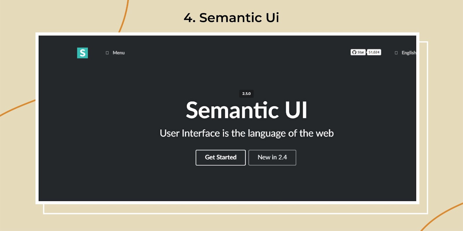
Semantic UI is a user-friendly React UI component library that aims to provide developers with a vocabulary for creating responsive and consistent web interfaces. It’s well-known for its human-friendly HTML, making it easier to understand and implement. Let's dive into its features, pros, cons, and use cases to see why Semantic UI might be the best React component library for your next project.
Features
- Human-Friendly HTML: Semantic UI uses descriptive class names that are easy to read and understand, making your code more semantic and meaningful
- Comprehensive Components: This package offers a wide range of React UI components, including buttons, forms, modals, and more.
- Theming: Provides extensive theming capabilities, allowing you to customize the look and feel of your application to match your brand.
- Responsive Design: Built with mobile-first principles, ensuring your applications look great on all devices.
- Modularity: Components are modular and reusable, making it easy to build complex interfaces without redundancy.
Pros
- Readability: Human-friendly class names make the code easy to read and maintain.
- Comprehensive: Offers a rich set of components, covering almost every UI need
- Customization: Extensive theming options allow for a high degree of customization.
- Responsive: Ensures your applications look great on any device.
Cons
- Bundle Size: This can be large, impacting performance if not optimized properly.
- Learning Curve: The wide array of features and components might overwhelm beginners.
- Dependency Management: Managing dependencies can be tricky, especially when integrating with other libraries or frameworks.
Use Case
Semantic is good when you want to create a custom react component and themes, building React applications that need to be translated into multiple languages is also good for MVP app development and applications that need to be integrated with third-party libraries.
E. Ant Design
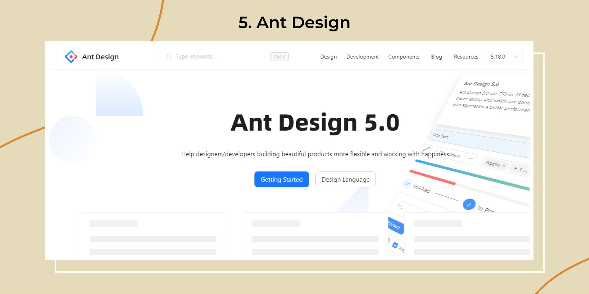
Ant Design has to have a place in the list, with a robust react UI framework that offers a wide range of high-quality components. Also, one thing to note is that this is widely used for enterprise-level applications, providing a consistent and professional look. Let's look at some of the features to understand this one clearly!
Features
- Comprehensive Component:- Ant Design offers many React UI components, from basic UI elements to complex data visualization tools.
- Design Guidelines:- Provides a set of design principles and guidelines to ensure consistency across your application.
- Theming:- Advanced theming options allow extensive customization to match your brand.
- Internationalization:- Built support for multiple languages.
- Responsive Design:- Ensure components work seamlessly across different devices and screen sizes.
Pros
- Rich Component Library:- Extensive collection of components to cover almost any use case.
- Customization:- High degree of customization with theming options.
- Global Reach:- Internationalization support is a big plus for international applications.
Cons
- Bundle Size: This can be quite large, impacting performance if not optimized.
- Complexity: With its vast feature set, it can be overwhelming for beginners.
- Opinionated Design: Adhering strictly to its design guidelines might limit flexibility.
Use Case
Ant Design’s extensive component library provides everything from charts and graphs to complex forms. The design guidelines ensure that the application looks consistent and trustworthy, which is important in the financial industry. Trust is key when dealing with money, after all!
F. Chakra UI
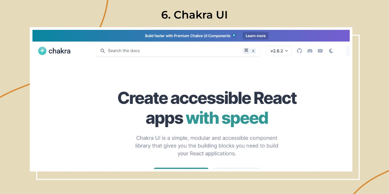
Chakra UI is a modern React UI library focusing on simplicity, modularity, and accessibility. With over 71,887 subscribes. It provides a set of accessible, reusable, and composable components that make building React applications a breeze. Let’s explore its features, pros, cons, and some practical use cases to understand how Chakra UI can elevate your development process.
Features
- Modular Components: Offers a wide range of modular and composable components, allowing for flexible and reusable UI building blocks.
- Theming: Comprehensive theming capabilities with a simple and intuitive API to customize the look and feel of your application.
- Responsive Design: Built-in responsive design utilities make creating interfaces seamlessly across different devices easy.
- Accessibility: Prioritizes accessibility, ensuring components are fully accessible and compliant with WAI-ARIA standards.
- Dark Mode Support: There is native support for dark mode, making it easy to switch themes and providing a better user experience.
Pros
- Ease of Use: The API is simple and intuitive, making it easy for developers to start and build applications quickly.
- Customizable: Highly customizable with built-in theming and styling options.
- Performance: Lightweight and optimized for performance, ensuring fast load times and smooth interactions.
- Community and Documentation: Strong community support and extensive documentation make it easier to find solutions and examples.
Cons
- Learning Curve: While the API is simple, fully leveraging the theming and styling system may take some time.
- Limited Pre-built Themes: Fewer pre-built themes than other libraries, requiring more initial customization.
- Potential Overhead: The modular nature might introduce overhead if not appropriately managed, leading to larger bundle sizes.
Use Case
Chakra UI is an excellent choice for applications that require a clean, modern, and accessible interface. For example, a financial portfolio management tool can benefit from Chakra UI’s modular components and responsive design utilities.
Its theming capabilities allow fintech companies to maintain a professional look while providing a seamless user experience across various devices. The built-in dark mode support is also a great feature for applications where users spend much time interacting with the interface, reducing eye strain during prolonged use
Why Choose Reactjs For Your Next Project: Features and Benefits
Read MoreHonorable mentions
A. TailWind Ui
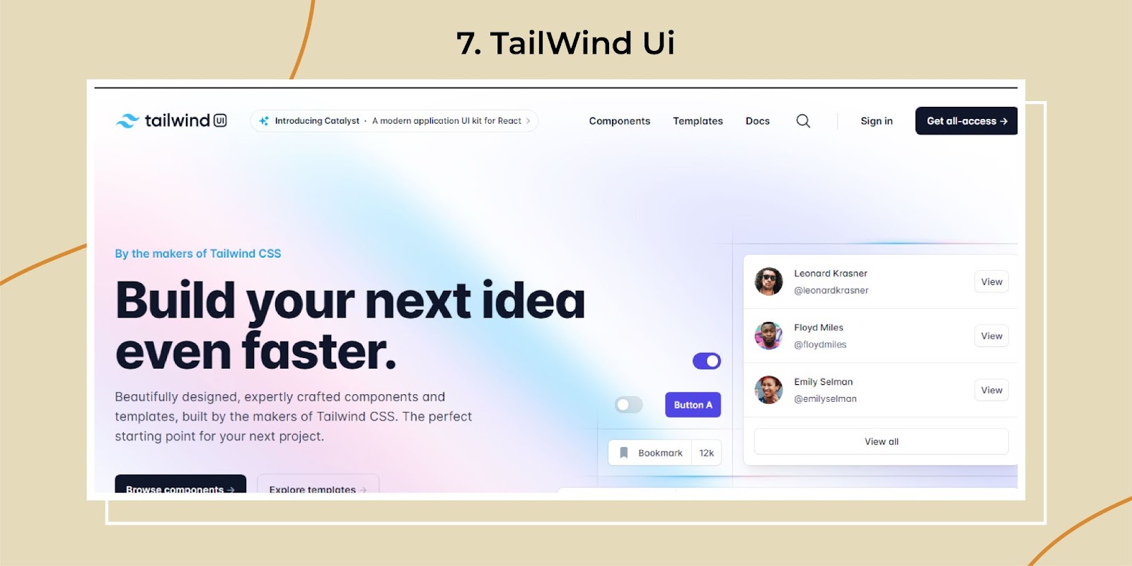
Tailwind UI is a utility-first React UI component library that offers a highly customizable approach to building user interfaces. It leverages the power of Tailwind CSS, allowing developers to create responsive, modern designs without writing a single line of custom CSS. Let’s explore the features, pros, cons, and use cases of Tailwind UI to understand why it might be the best React component library for your next project.
Features
- Utility-First Design: This design utilizes Tailwind CSS to provide a wide range of utility classes, enabling rapid development of custom designs.
- Pre-Built Components: Offers a comprehensive set of pre-built React UI components, including forms, buttons, modals, and more.
- Responsive Design: Built with mobile-first principles, ensuring your designs are fully responsive out of the box.
- Customization: Highly customizable, allowing you to tweak every design aspect using utility classes.
- Documentation: Extensive documentation and examples make it easy to implement complex designs.
Pros
- Flexibility: Highly flexible and customizable, making it easy to create unique designs.
- Efficiency: The utility-first approach speeds up the development process.
- Responsive: Ensures your designs look great on any device.
- Community: Strong community support and extensive documentation.
Cons
- Learning Curve: The utility-first approach can be overwhelming for beginners.
- Verbose Code: This can result in verbose HTML due to the many utility classes.
- Dependency: Requires familiarity with Tailwind CSS to leverage its capabilities fully.
Use case
Tailwind UI’s flexibility and customization options are invaluable. With Tailwind UI, you can easily customize the design to match your brand’s identity while ensuring a responsive and user-friendly experience.
Plus, the utility-first approach allows for rapid prototyping and iteration, which is important in the fast-paced fintech world. Because, let’s face it, nobody wants their trading app to look like it’s stuck in the '90s
B. Flow Bit
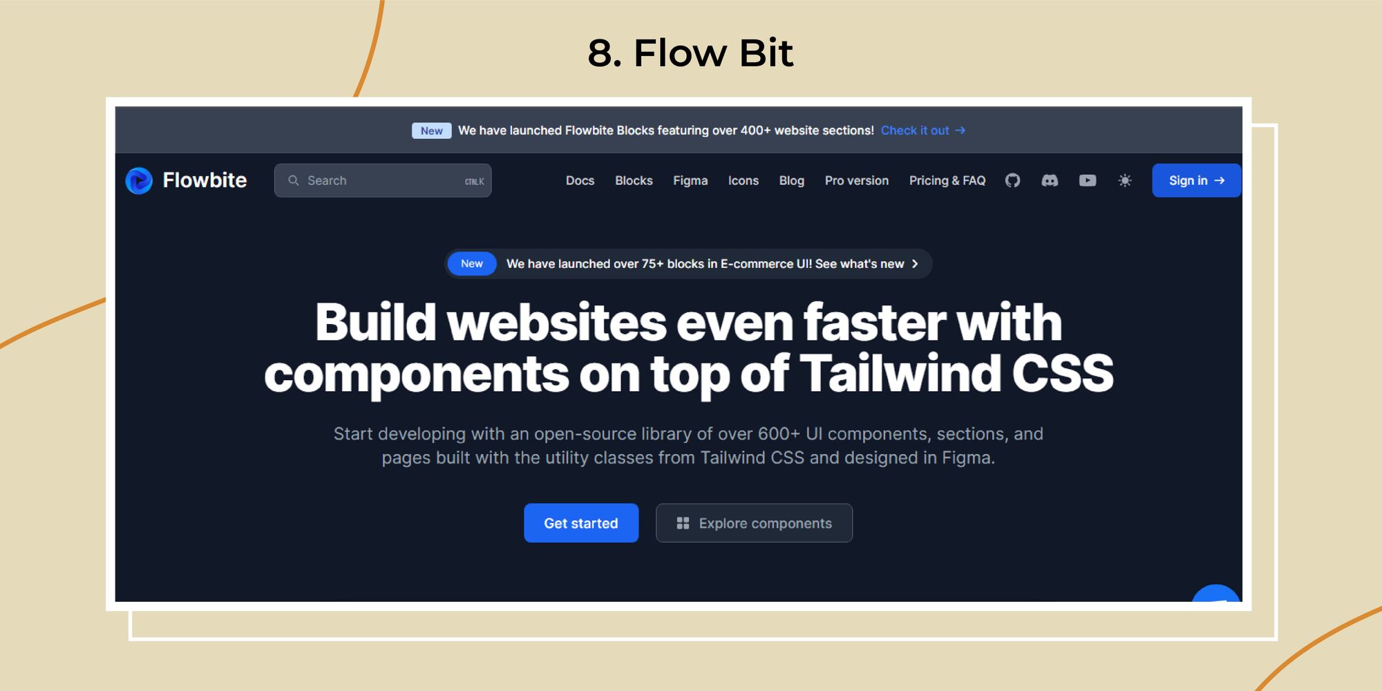
Flowbite is another powerful React UI component library that integrates seamlessly with Tailwind CSS. It provides a collection of pre-designed components and templates, making building beautiful and responsive web applications easier. Explore its features, pros, cons, and use cases to see why Flowbite might be the best React UI framework for your next project.
Features
- Tailwind CSS Integration: Built on top of Tailwind CSS, offering a seamless integration and utilization of utility classes.
- Pre-Designed Components: Includes a wide range of pre-designed React UI components, such as forms, buttons, alerts, and more.
- Templates: Offers ready-to-use templates for various use cases, speeding up development.
- Customization: Highly customizable, allowing you to adapt the components to fit your needs.
- Documentation: Provides extensive documentation and examples to help you get started quickly.
Pros
- Integration: Seamless integration with Tailwind CSS.
- Pre-Designed: Wide range of pre-designed components and templates.
- Customizable: High degree of customization with utility classes.
- Efficiency: Speeds up the development process with ready-to-use components and templates.
Cons
- Learning Curve: Requires familiarity with Tailwind CSS.
- Verbose HTML: Utility-first approach can lead to verbose HTML.
- Dependency: Relies heavily on Tailwind CSS for styling.
Use Case
Flowbite’s pre-designed components and templates can be a game-changer. Imagine a campaign management tool where users can create, track, and analyze ad performance.
Flowbite’s ready-to-use components ensure the platform is functional and visually appealing.
The integration with Tailwind CSS allows quick customization to match the brand’s identity. With its efficiency, you’ll have more time to focus on those creative ad strategies because nobody wants to spend hours tweaking button styles
C. Next UI
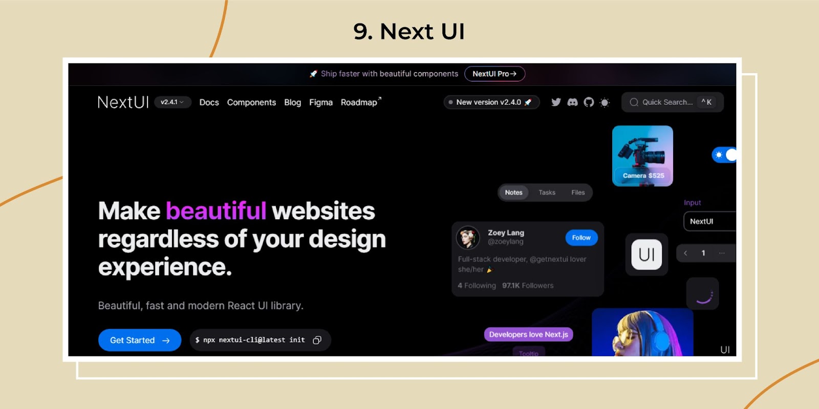
NextUI is a modern React UI framework that emphasizes simplicity and performance. It provides a set of beautiful and accessible components designed to help you build responsive web applications quickly. Let's explore its features, pros, cons, and use cases to see why NextUI might be your next project's most popular React framework.
Features
- Modern Design: Offers a sleek and contemporary design focusing on aesthetics and usability.
- Accessibility: Prioritizes accessibility, ensuring that all components are fully accessible.
- Responsive Design: Built with responsiveness in mind, ensuring your applications look great on all devices.
- Theming: Provides extensive theming capabilities, allowing you to customize the look and feel of your application.
- Performance: Optimized for performance, ensuring fast load times and smooth interactions.
Pros
- Aesthetic Design: Beautiful and modern design that enhances user experience.
- Accessibility: Ensures all components are accessible, improving usability for all users.
- Performance: Highly optimized for performance.
- Theming: Extensive theming options for customization.
Cons
- Limited Components: Smaller library compared to some other React component libraries.
- Learning Curve: May require some time to get used to its specific design and theming system.
- Dependency: Relies on its own design system, which may not be compatible with other libraries.
Use Case
NextUI’s modern design and performance optimization are ideal. Imagine building an analytics platform that displays real-time data in a visually appealing and accessible way. NextUI’s sleek components ensure users have a smooth experience, while the extensive theming options allow for branding customization. Because when dealing with finances, you want everything to look as sharp as your users’ suits.
Top 14 React Libraries You Must Try in 2020
Read MoreWrapping it up!
Well, here we have the best React UI component library in 2024. Don’t forget to check the horrible mentioned as well. From the Sleep design principle to the modular approach, each library has its unique strengths to the table. Whether you are building a complex application or a minimalistic healthcare application, this React UI library will improve your development process.
Wait, there is more!
If you are looking for to Hire React Developer. We at Third Rock Techkno can help you build applications that will help you grow your business. We have a decade of experience in custom software development and offer a free consultation (Shameless plug ;P). Contact us now to have a word with our experts!
Frequency Ask Questions (FAQs)
- What is the React UI component Library?
A React UI component library is a collection of pre-built, reusable UI components developers can use to build applications more efficiently. These libraries provide various elements like buttons, forms, and models, which help streamline development. - Why should I use a React UI component Library?
Using a React UI component Library can save time and effort by providing pre-designed and tested components. This allows developers to focus more on the application's functionality than on designing UI elements from scratch. - Which React UI component library is best for enterprise-level applications?
Ant Design is often preferred for enterprise-level applications due to its comprehensive component library, advanced theming options, and internationalization support. Its design principles ensure a consistent and professional look across large-scale applications. - Can I customize the components in these libraries?
Yes, most React Ui component Libraries offers extensive customization options. Libraries like Material UI, Ant Design, and Chakra UI provide robust theming capabilities, allowing you to tailor the components to match your brand's identity.