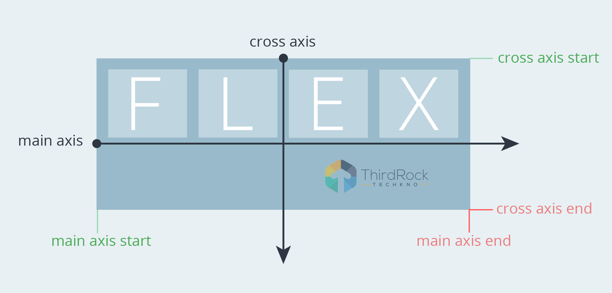
What is Flex / Flexbox
Flexbox is a layout model that allows their children elements to align horizontal and vertical with distributing space within a container.
When to use Flex / Flexbox
We can use flexbox when we need to resize their children’s size or growing to fill unused space or shrinking to avoid overflowing the flex container.
Using flexbox we can set widths and heights and their elements can be aligned to fill a space or distribute space between elements.
When we do not need to use Flex / Flexbox
We should not use it for a single div.
We should avoid it if we do not need to handle its children’s unused space.
Flex container has two types of values: 'flex' and 'inline-flex'
display: flex
- This container will work like a block element
display: inline-flex
- This container will work like an inline-block element. We can inline-flex element if their child does not have enough space, otherwise, both the container behavior is the same.
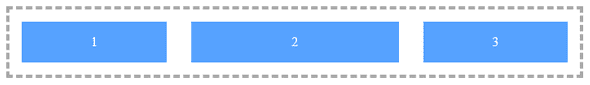
The sample code below
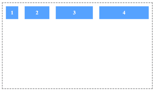
HTML
<div class="flex-container">
<div class="flex-item">1</div>
<div class="flex-item">2</div>
<div class="flex-item">3</div>
</div>
CSS
.flex-container {
display: flex;
flex-direction: row;
flex-wrap: wrap;
border: dashed 4px #A9A9A9;
color: white;
}
.flex-item {
margin: 15px;
background: #56a2ff;
text-align: center;
min-height: 50px;
line-height: 50px;
font-weight: 600;
}
.flex-item:nth-of-type(1) {
width: 60px;
}
.flex-item:nth-of-type(2) {
width: 120px;
}
.flex-item:nth-of-type(3) {
width: 180px;
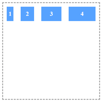
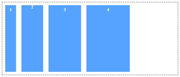
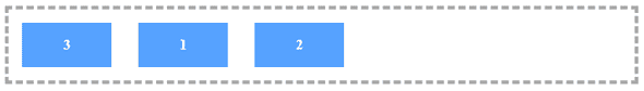
}In the first example, we have simply added elements in a single row. But there is more:
- row (default): Arranges the elements from left to right.
- row-reverse: Reverses the order of elements in a row disposition
- column: Arranges the elements from top to bottom
- column-reverse: Reverses the orders of elements in a column disposition
Flex Direction
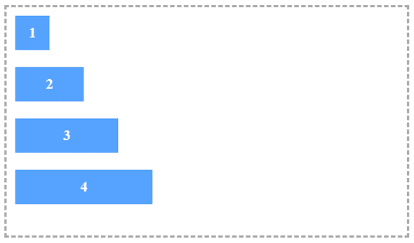
.flex-container {
    flex-direction: column;
}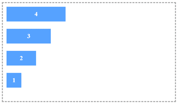
.flex-container {
    flex-direction: column-reverse;
}
.flex-container {
    flex-direction: row;
}
.flex-container {
flex-direction: row-reverse;
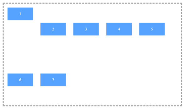
}Flex Wrap
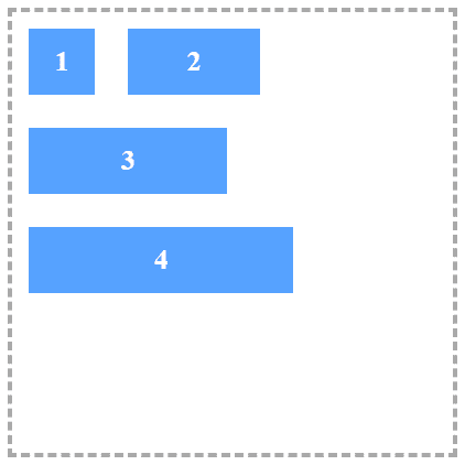
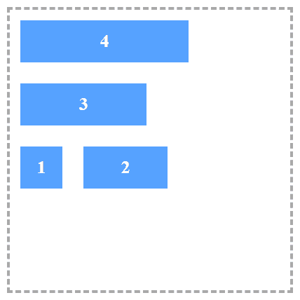
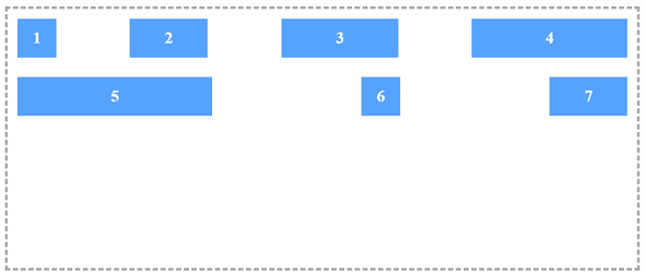
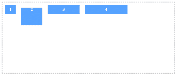
In our first example the wrapper children do not show in the up-down container in single row. So we can set up-down into a single row like this :
- nowrap (default): Prevents the items in a flex container from wrapping
- wrap: Wraps items as needed into multiple rows (or columns, depending on flex-direction)
- wrap-reverse: Just like the wrap, but the number of rows (or columns) grows in the opposite direction as items are wrapped
.flex-container {
    flex-wrap: nowrap;
}
.flex-container {
    flex-wrap: wrap;
}
.flex-container {
    flex-wrap: wrap-reverse;
}
Flex Flow
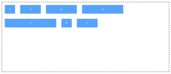
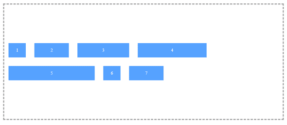
We can merge flex-direction and flex-wrap into a single property called flex-flow
.flex-container {
    flex-flow: {flex-direction} {flex-wrap};
}
Justify Content
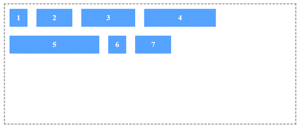
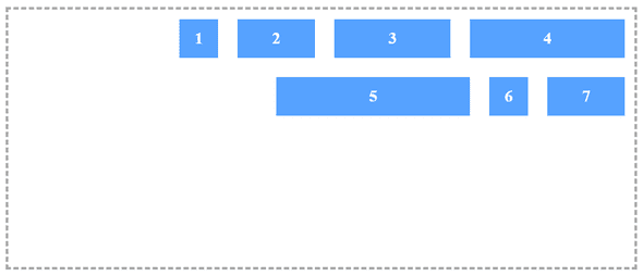
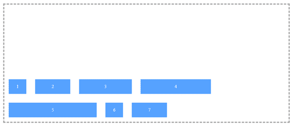
Below mentioned properties are used to control the horizontal alignment of the child elements:
- flex-start (default): Elements are aligned to the left (similar to inline elements with text-align: left)
- flex-end: Elements are aligned to the right (similar to inline elements with text-align: right)
- center: Elements are centered (similar to inline elements with text-align: center)
- space-around: Every element will be rendered with the same amount of space around each item. Note that the space between two sequential child elements will be double the space between the outermost elements and the sides of the container.
- space-between: Just like space-around, except the elements will be separated by the same distance and there will be no space near either edge of the wrapper.
.flex-container {
    justify-content: flex-start;
}
.flex-container {
    justify-content: flex-end;
}
.flex-container {
    justify-content: center;
}
.flex-container {
    justify-content: space-around;
}
.flex-container {
justify-content: space-between;
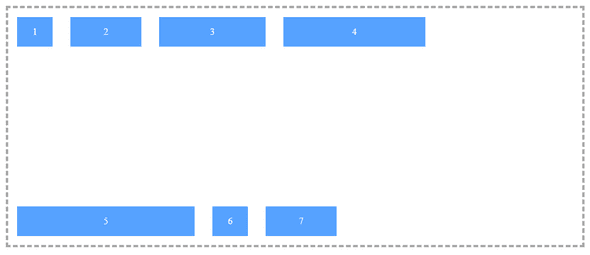
}Align Items
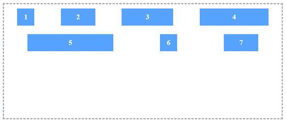
Below mentioned properties are similar to justify-content but the context of its effects is the rows instead of the container itself:
- flex-start: Elements are vertically aligned to the top.
- flex-end: Elements are vertically aligned to the bottom.
- center: Elements are centered vertically within the container (A safe practice to achieve this).
- stretch (default): Forces the elements to occupy the full height (when applied to a row) and the full width (when applied to a column) of the container.
- baseline: Vertically aligns the elements to their actual baselines.
.flex-container {
    align-items: flex-start;
}
.flex-container {
    align-items: flex-end;
}
.flex-container {
    align-items: center;
}
.flex-container {
    align-items: stretch;
}
.flex-container {
    align-items: baseline;
}
Align Content
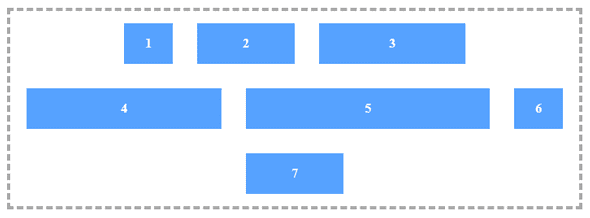
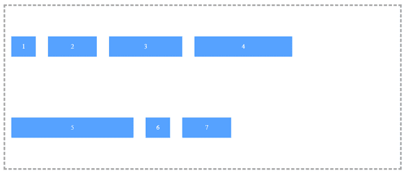
Below properties are works in the vertical axis and the context is the entire container (not the row like the previous example). To see its effects, you will need more than one row:
- flex-start: Rows are vertically aligned to the top (i.e., stacked from the top of the container).
- flex-end: Rows are vertically aligned to the bottom (i.e., stacked from the bottom of the container).
- center: Rows are centered in the container vertically.
- stretch (default): In general, this property stretches the elements to utilize the entire vertical height of the container. However, if you have set some specific height of the elements, that height will be honored and the remaining vertical space (in that row, below that element) will be empty.
- space-around: Every row will be rendered with the same amount of space around itself vertically (i.e., below and above itself). Note that the space between two rows will, therefore, be double the space between the top and bottom rows and the edges of the container.
- space-between: Just like space-around, except the elements will be separated by the same distance and there will be no space on the top and bottom edges of the container.
.flex-container {
    align-content: flex-start;
}
.flex-container {
    align-content: center;
}
.flex-container {
    align-content: flex-end;
}
.flex-container {
    align-content: space-around;
}
.flex-container {
    align-content: space-between;
}
.flex-container {
    align-content: stretch;
}
Flex Grow
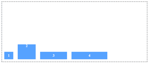
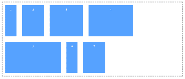
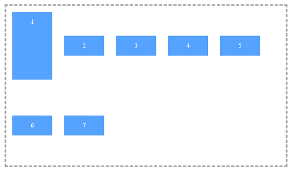
This property sets the relative proportion of the available space that the element should be using. The value should be an integer, where 0 is the default.
Let’s say you have two different elements in the same flex container. If both have a flex-grow value of 1, they will grow equally to share the available space. But if one a flex-grow value of 1 and the other a flex-grow value of 2, as shown in the example below, this one with a flex-grow value of 2 will grow to take twice as much space as the first.
.flex-item {
flex-grow: 1; /* Default 0 */
}
.flex-item:nth-of-type(2) {
flex-grow: 2;
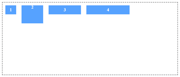
}Align Self
The below property will apply individually to each element. The possible values are:
- flex-start: Vertically aligns the element to the top of the container.
- flex-end: Vertically aligns the element to the bottom of the container.
- center: Vertically centers the element within the container (at last, a simple way to achieve this!).
- stretch (default): Stretches the element to occupy the full height of the container (when applied to a row) or the full width of the container (when applied to a column).
- baseline: Aligns the elements according to their actual baselines.
.flex-item:first-child {
     align-self: flex-start;
}
.flex-item:first-child {
     align-self: flex-end;
}
.flex-item:first-child {
     align-self: stretch;
}
Order
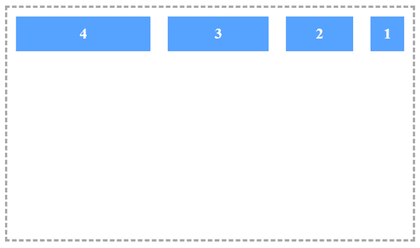
Flexbox has the ability to reorder elements using the order property without modifying the DOM element. In much the same way that z-index controls the order in which items are rendered, order controls the order in which elements are positioned within the container. Elements with a lower order value are positioned before those with a higher order value
.flex-item:last-child {
     order: -1;
}
Flex Shrink
flex-shrink is a similar to flex-grow, this property sets whether the element is “shrinkable” or not with an integer value. Similar to flex-grow, flex-shrink specifies the shrink factor of a flex item.
.flex-item {
     flex-shrink: 1; /* Default 0 */
}
Flex Basis
"flex-basis" is a property that sets the default size of an element before available space is distributed and elements are set as per space. It unsupported to calc() and box-sizing: border-box in every browser, So better use width, and if you need to use then set flex-basis: auto;
.flex-item {
     flex-basis: size || auto; /* Default auto */
}
Flex
"flex" is a shorthand operator to define flex-grow, flex-shrink, and flex-basis properties in single line as follows :
.flex-container {
     flex: {flex-grow} {flex-shrink} {flex-basis};
}Third Rock Techkno is a leading IT services company. We are a top-ranked web, voice and mobile app development company with over 10 years of experience. Client success forms the core of our value system.
We have expertise in the latest technologies including angular, react native, iOs, Android and more. Third Rock Techkno has developed smart, scalable and innovative solutions for clients across a host of industries.
Our team of dedicated developers combine their knowledge and skills to develop and deliver web and mobile apps that boost business and increase output for our clients.